You can surprise your friends by writing their names on a brick texture. To make them surprised, you work must be accurate and realistic. Today I'm gonna show how to blend text with a brick wall through Adobe Photoshop . . .
Note: This tutorial is prepared on Photoshop CS6. Some options may not be similar if you're using older versions of Photoshop.
The Brick Wall
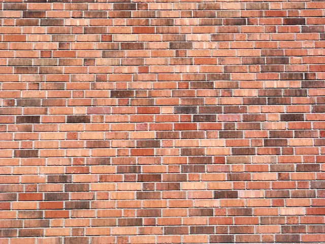
The very first thing you need is a brick wall. You can easily find one through Google search - Brick Texture or Brick Wall.
Or you can simply use the same brick wall which I'm gonna use in this tutorial -
Image Information -
- File Type: JPEG
- Dimensions: 1200 x 800
- DPI: 96
- Image Size: 276 KB
Using a better image is very important since it may affect your output quality. A poor quality image may not generate a realistic view. So you can either use this image in your project, or find a better one.
Choosing a Font
Choose a font which is thick enough. Our purpose is to capture as many bricks as possible in our text background.
I would like to suggest you 2 fonts - 1. Cooper Black 2. Hobo Std
Or you can choose any other font which you prefer. But my suggestion will be - choose a thick or bold font.
First Phase
- Run Photoshop from your PC.
- Press Ctrl + O > Choose brick wall and open it.
- Press T to enable Type Tool. Choose a font - Cooper Black.
- Choose a brown color. Color code is # 990000.
- Now type your text.
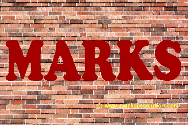
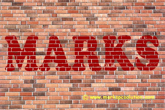
At this point, your document will look like this -
Second Phase
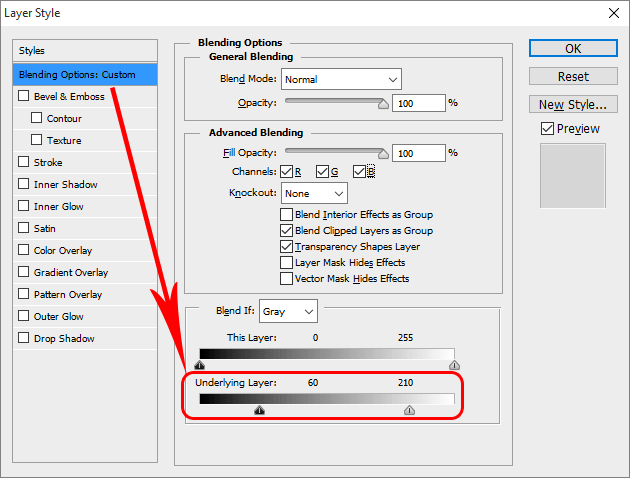
Make sure your text layer is selected in the layer panel. Now hit on the fx button from the bottom of the layer panel > Choose Blending Options > Now you will get the Layer Style window.
Now select the very first option - Blending Options: Custom
Look at the above image, you've to use the Underlying Layer. Set the left slider to 60 and right slider to 210.
(You can set different values if you think it looks better)
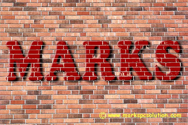
After completing the second phase, your document will have this look -
After completing the second phase, your document will have this look -
Third Phase - Optimize the look . . .
Our main task has been completed in the previous step. But you can look it better through -
- Bevel & Emboss
- Inner Shadow
- Drop Shadow etc.
Let's back to the work -
- Hit on the Bevel & Emboss | Style - Inner Bevel, Technique - Smooth, Depth - 100, Direction - Up, Size - 5. Keep the Shading part untouched.
- Hit on the Drop Shadow | Blend Mode - Multiply, Opacity - 75 to 100, Angle - 1450, Check Use Global Right, Distance - 8, Spread - 5, Size - 9.
All done! Hit on the OK button.
This is your final view. From the Layer Style window, you can set different values for different options and get different result.
Final Phase - Wait a minute!
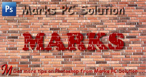
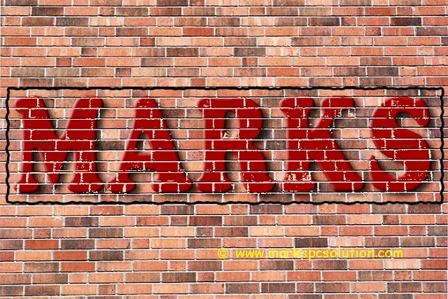
Final touch is still waiting. Have a look at the image below -
Wanna get a view like this? Simply draw a rectangle around your text.
- Set the Fill value to 0%.
- Make a right click and choose Blending Options.
- Choose Stroke | Size 4, Outside, 100% Opacity > Hit OK.
- Go to Filter > Distort > Ripple > OK. That's it!
You should download this project file for better understanding. Thank you for visiting us . . .
Comments
Post a Comment